Today is Blog Action Day, a day when bloggers all over the world unite to discuss a particular topic. What a lot of people may not know is that Envato founders, Collis and Cyan Ta’eed founded Blog Action Day in the summer of 2007 hoping to raise awareness about the environment. Since then, Blog Action Day has become a huge success with the participation of thousands of blogs including the White House and the UK Foreign Office. Today, Blog Action Day is being managed by the team at Change.org; the topic of this year’s event is Water.
Right now, almost a billion people on the planet don’t have access to clean, safe drinking water. That’s one in eight of us who are subject to preventable disease and even death because of something that many of us take for granted. Psdtuts has decided to help raise awareness of the issue by doing what we do best, publishing tutorials. Today’s tutorial will demonstrate how to create a wallpaper for Blog Action Day. So let’s get started!
Tutorial Assets
Step 1
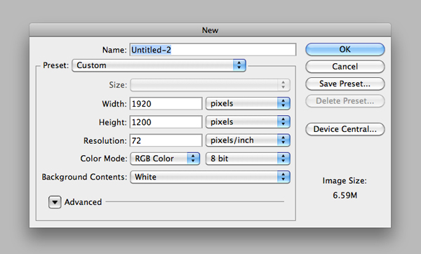
Let’s start by creating a new document in Photoshop. Since the poster is not destined to print, but to be a wallpaper, the size of my document is 1920×1200 pixels at 72 px/inch of resolution. Start by filling the background with a neutral grey color (#bababa).
Step 2
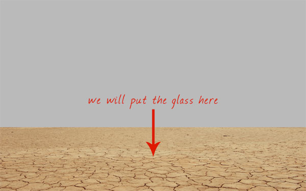
The theme is "water". So we have to introduce something that symbolizes water, of course. As it’s in my habits, I try to put in 2 contrasting elements: a glass of water in a desert landscape. Since the glass is a small object, to make it more prominent it’s important to choose the right perspective. So let’s put the glass in front of the camera, with the landscape behind. The first thing to create: the arid landscape. Let’s draw a brown (#927a60) rectangle and place it to the bottom. This rectangle represents our horizon.

Step 3
Download the Desert Land image. I found this image on Shutterstock, but you can find tons of free photos on sites like Stock.xchng.
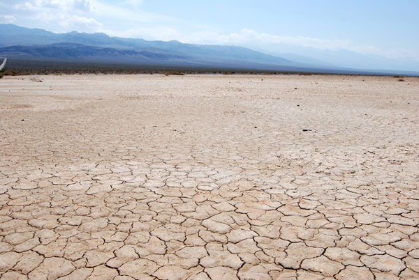
Paste the image onto the main canvas and set it to overlay, so you can see how it affects the brown rectangle. If necessary, squash the image (Cmd/Ctrl + T) until you’re satisfied with the perspective (always in the area of the brown rectangle).
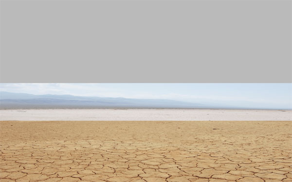
Eliminate the area of the landscape that exceeds the rectangle. You can use the Rectangular marquee tool to select the area, then you can delete or mask it.
Step 4
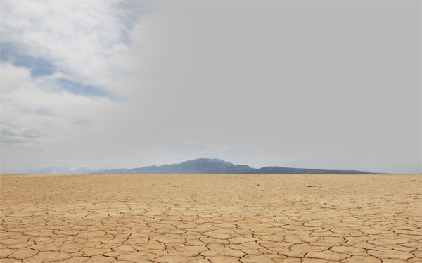
To fill the canvas, we can use this image of a mountain in a desert. Place it behind the rectangle.
Step 5
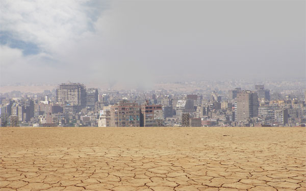
Download this photo of a city in the desert and place it above the mountain’s layer. Then gently erase the sky from the photo.
Step 6
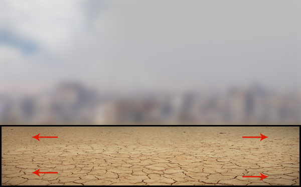
The depth of the ground is not so evident. So grab a soft black brush and paint over the edges of the ground.
Step 7
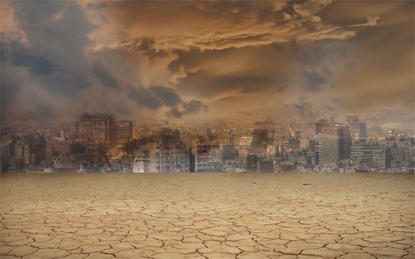
Let’s focus our attention on the sky: at the moment we have a flat sky but an overcast sky will work better. The user will have the impression that a storm is imminent, and this can represents a metaphor: if we don’t respect water, the situation that troubles some countries of the world will trouble the entire world, just like a moving storm.
Download this image of a cloudy sky and paste it into the canvas. With a large soft brush, erase the bottom area. Then set the layer to multiply with opacity around 80%.
Step 8
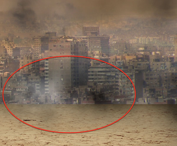
I’m not satisfied with the clouds. To be more precise, I think the image needs more smoke effects coming from the city. For this purpose you can use 2 techniques: you can download a cloud brush set and use them to paint over the horizon, or to use the cloud filter in Photoshop. With the help of the lasso tool, with feather set on around 30px, make casual selections, then go to Filter > Render > Clouds, set the layer to multiply or screen (depending by if you want black or white smoke effects) and erase exuberant parts of the smoke. You should obtain something like this.
Step 9
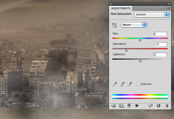
To complete the background, we need 2 adjustment layers. At first desaturate the entire image with a hue/saturation layer (Layer > New Adjustment Layers > Hue/Saturation). Reduce saturation to around -50.
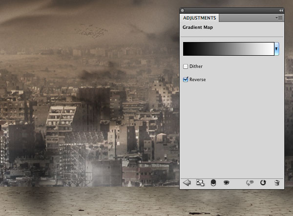
Secondly, add a gradient map layer (Layers > New Adjustment Layers > Gradient Map) going from black to white and set to overlay. Reduce the opacity if necessary. Once done, remember to select all the layers created till now, group them and title this group "background".
Step 10
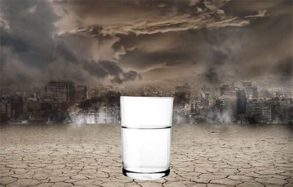
Now that the background is complete, we can introduce the focus of the composition: the glass of water. Download this image, then use the pen tool to extract the glass and drag it into the main canvas.
Step 11
Use the Rectangular Marquee tool to select an area on top of the glass and move it up with the Direct Selection tool active.
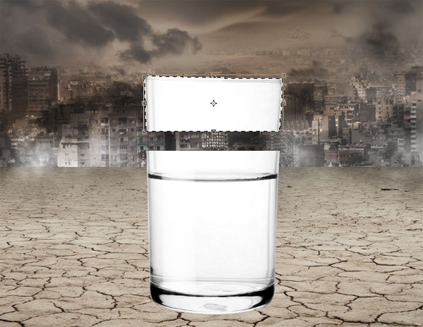
Step 12
With the selection still active, press Cmd/Ctrl + T to activate the transform tool and drag down the bottom-center anchor point to join the 2 parts of the glass.
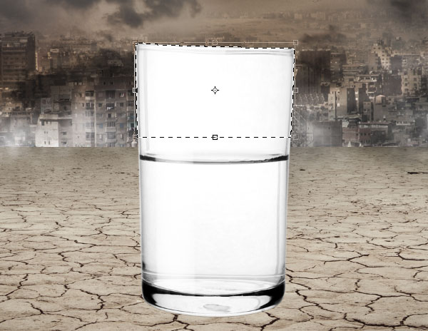
Now the glass is too long. Press Cmd/Ctrl + D to deselect, then again Cmd/Ctrl + T (this time the transformation will affect the entire glass) and reduce the height of the glass.
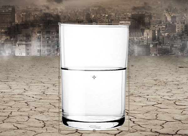
Step 13
In order to eliminate the white area, set the glass’ layer to multiply.
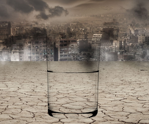
Then duplicate (Cmd/Ctrl + J) it and set the duplicated to screen because the inner part needs to be a little bit lighter than the external one. Reduce the layer opacity to around 30% and erase the edges with a soft (hardness 0%) brush.
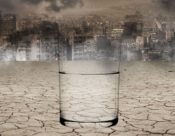
Since the edge’s opacity is too low, duplicate the layer and set it to multiply. Also notice that I’ve painted with a thin black brush over the water rim to make it more evident.
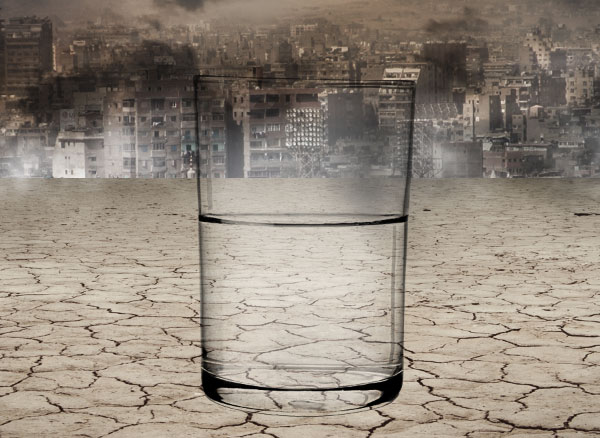
Step 14
Create a new layer and switch its blending mode to overlay. Then set a light azure as foreground color and paint over the water. The aim of this step is to add more color to the glass, so that after the final color corrections, it will be enhanced. Remember to reduce the opacity to around 20% or the result will be too prominent.
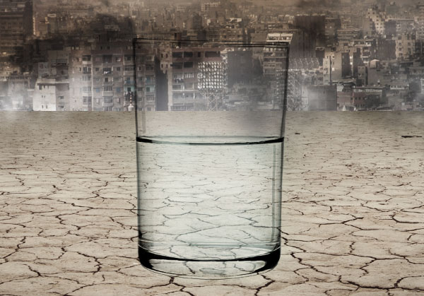
Step 15
To complete the glass, we have to add the shadow. So create a new layer, move it below all the glass layers and paint with a soft round black brush to create the shadow. To make the effect more realistic, use more than one layer and play with their opacities.
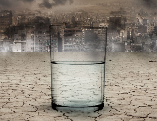
Step 16
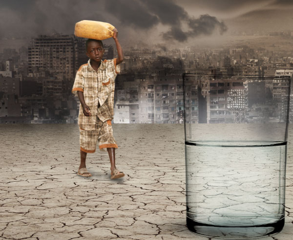
Download the child and extract him from the background. Scale him down and paint the shadow effects in a layer below as we made with the glass.
Step 17
Since the glass is the focal point (imagine viewing the scene through a camera), the scene behind the glass should be blurred. So in the layers window, select the group of the background and the child’s layer, and press alt + Cmd/Ctrl + E to merge them in a new layer. Then apply the Gaussian blur filter.
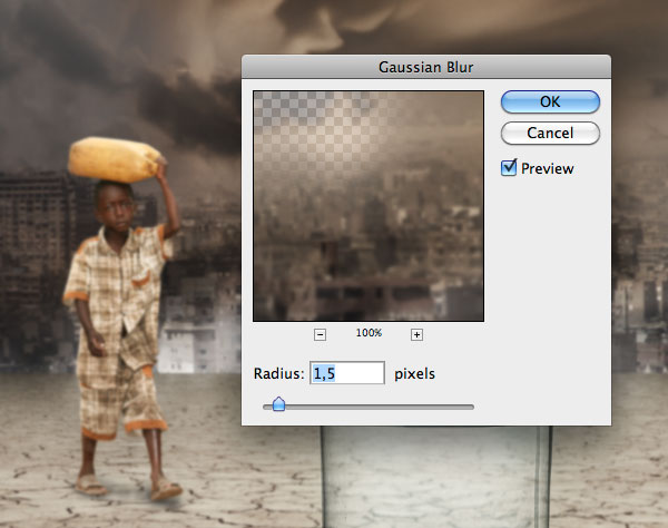
Add a layer mask and use a large soft black brush to paint over the area around the glass, because this area is inside the focus so it can’t be blurred.
Step 18
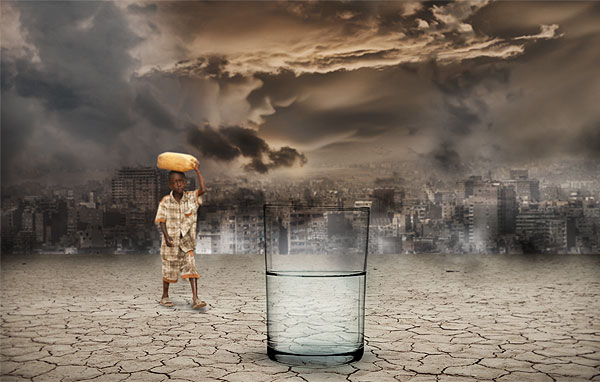
It’s time to play with lights. The first thing to do is to darken the edges of the composition. So create a new layer on top, grab a large round black brush of around 1500px, set hardness to 0% and paint over the edges of the canvas. Then reduce the opacity.
Step 19
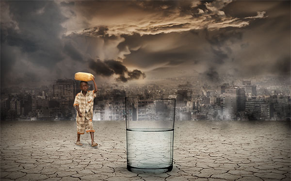
Lights give depth to the scene. So create a new group and switch its blend mode to color dodge. Create a layer inside the group and use always a large white brush with hardness 0% to paint over the center and other areas that you want to enhance. After done, reduce the opacity so the effect won’t be excessive.
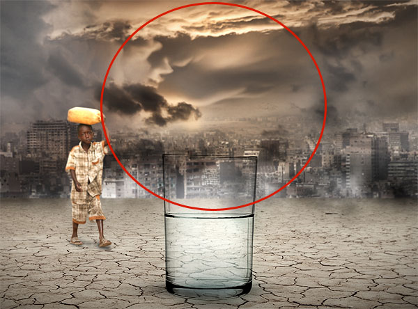
Step 20
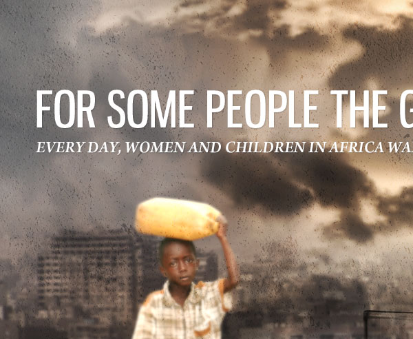
Type the message "For some people the glass is always half empty". The font used is Gnuolane. Immediately below another sentence, this time written using Arno Pro, which is a default font on the Mac. In case you haven’t it, you can use any serif italic font of your choice. The text is proposed with no style, because I like how it looks so simple and clean. The only style is a 1px drop shadow, just to stand out a bit the text from the background.
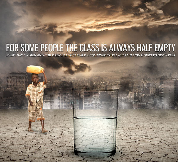
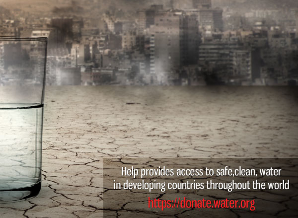
Another written message is put on the bottom right, balanced by the presence of the boy on the left. The font used is Gnuolane.
Step 21
Before starting with color corrections, we can play with a couple of textures. The first one is an old paper texture taken from the black and white grunge textures set I published on WeGraphics. Once pasted into the Photoshop document, apply a couple of times the sharpen filter so that all the details will be enhanced.
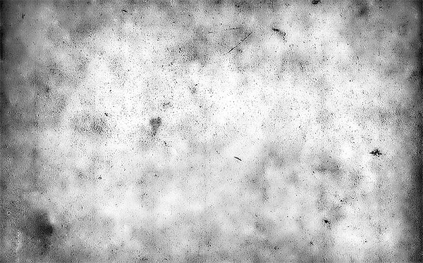
Switch the texture to overlay with opacity 20%.
Step 22
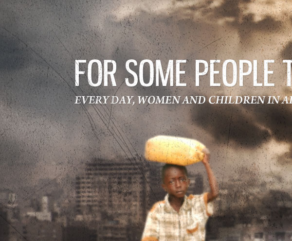
The second texture I’ve used is a scratched metallic texture. I like the way scratches can interact with the images, the blur background and the meaning itself of the scene. Once again paste in the metallic image, desaturate it (Cmd/Ctrl + Shift + U), set layer to multiply with opacity 30% and apply the sharpen filter.
Step 23
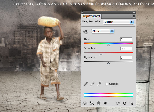
The last 2 steps are color corrections. As I often do in my tutorials, let’s start reducing the saturation with a hue/saturation adjustment layer. Set the saturation level to -30.
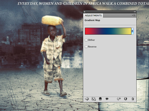
Finally add a gradient map layer going from red (#ee202e) to blue (#004274) to yellow (#f9e260). Set the layer to overlay with opacity 40%.
Conclusion
That’s it! We are done. For more information on Blog Action Day, don’t forget to visit the Blog Action Day website.
Source: http://feedproxy.google.com/~r/psdtuts/~3/RFzJ9spqysc/
designer laptop bags on wheels designer laptop bags stylish laptop bags designer laptop bags with wheels designer messenger bags designer messenger bags 2010

No comments:
Post a Comment